Directus Treemap Chart Panel

Present a cluster or boxes on your Directus Dashboard where the size of each box represent the value. You can also group data into categories which are presented in different colors and hover over data points to reveal the value (if enabled). Only permitted data will be shown to the user.
Getting Started
Install the panel via the marketplace. The panel will be available when adding new panels to a dashboard (Insights). Once added, position and resize the panel as required. While small, the graph won't show legends or labels.
If you choose to group the data into different series, a legend will appear at the bottom. Hover over a series in the legend to highlight all data for that series. You can also toggle which series are visible by clicking the series label in the legend.
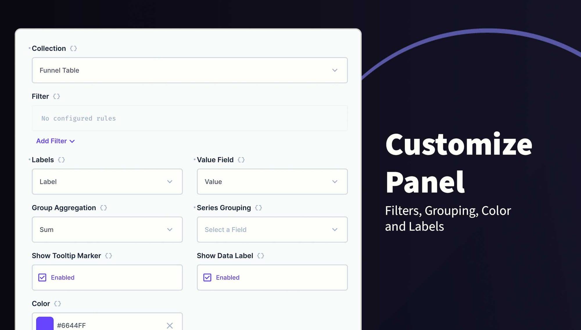
You can change the following options:
- Collection Selection
- Filters
- Label Field
- Value Field
- Group Aggregation (Sum, Average, Count, Max and Min)
- Series Field
- Hide/Show Labels
- Hide/Show Tooltips
- Color
Requirements
- Directus 10.10.0+
- String field for the Label and Series
- Integer, BigInteger, Float or Decimal field for Value
- Fields must be in the same table
Example
| Platform | Visits | Country | Date |
|---|---|---|---|
| Website | 76 | USA | 2024-10-02 |
| Social | 10 | USA | 2024-10-02 |
| Website | 100 | USA | 2024-10-03 |
| Social | 30 | USA | 2024-10-03 |
| Website | 96 | UK | 2024-10-03 |
| Social | 38 | UK | 2024-10-03 |
How to Customize this Panel
- Create a new Panel and select Treemap Chart from the list
- Choose the collection and the fields to use for the Labels and Values
- (Optional) Filter the data to your scope
- Select how to Aggregate the data
- (Optional) Select the field to Group data into series
- (Optional) Use the header to create a name for this panel
- Save the panel and position/resize as required
- Save the dashboard
Check it out on NPM