Properties Available to a Directus Interface
When creating an interface for Directus, have you wondered what data is already available to you? Here is a complete list of all properties sent to an Interface extension.
const props = defineProps<{
  autofocus: boolean;
  disabled: boolean;
  loading: boolean;
  value: number | string | null;
  batchMode: boolean;
  batchActive: boolean;
  width: 'half' | 'full';
  type: string;
  collection: string;
  field: string;
  fieldData: Field;
  primaryKey: number | string | '+';
  length: number | null;
  direction: string;
}>();
If you are unsure what these do, I've written more information about each property.
Auto Focus
This is a boolean property and is almost always false. The purpose is to make the current field focussed (or active) when the item page is opened.
Disabled
This is a common property and worth implementing. If a field is marked as disabled in the Data Studio, this property will be true. Use this property to prevent changes to your interface make it obvious to the user they can't make changes.
Loading
This is a common property and worth checking its value before rendering your interface. Some data only becomes available once loading becomes false. You can use the v-skeleton-loader component to visually represent your extension's loading state.
Value
This contains the current value for the field. It is null by default and will be populated with its existing value once loading becomes false. This property can be bound to the modelValue field in your interface.
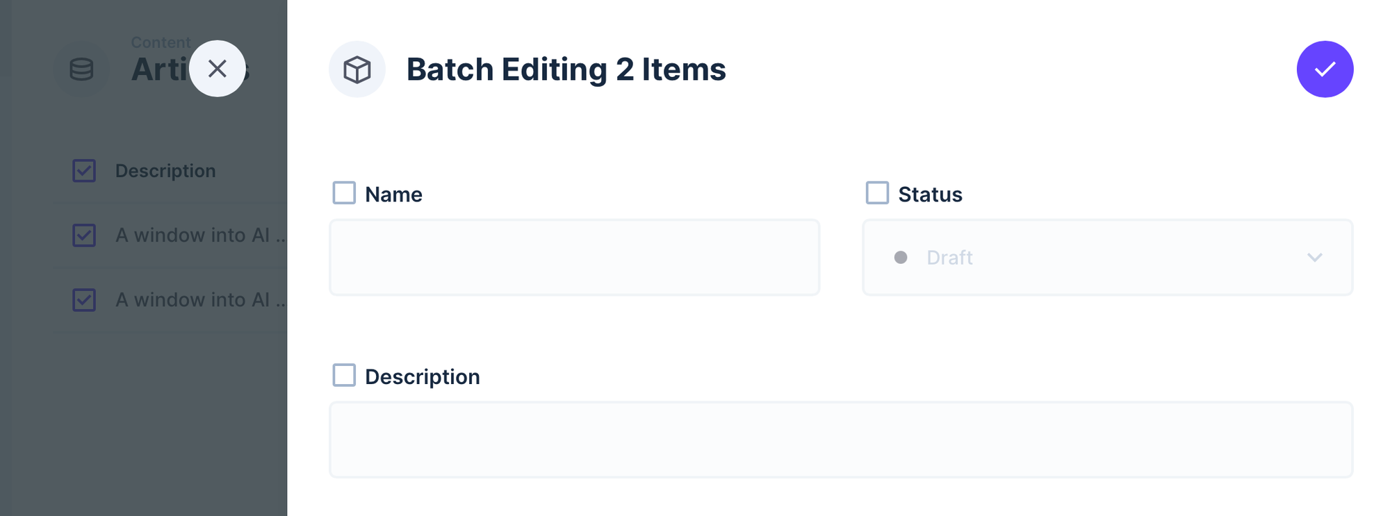
Batch Mode
This property is a boolean that will only be true when the user is batch editing content. You can use this property to change the appearance or functionality of your extension while in Batch mode. Here is an example of the batch view.
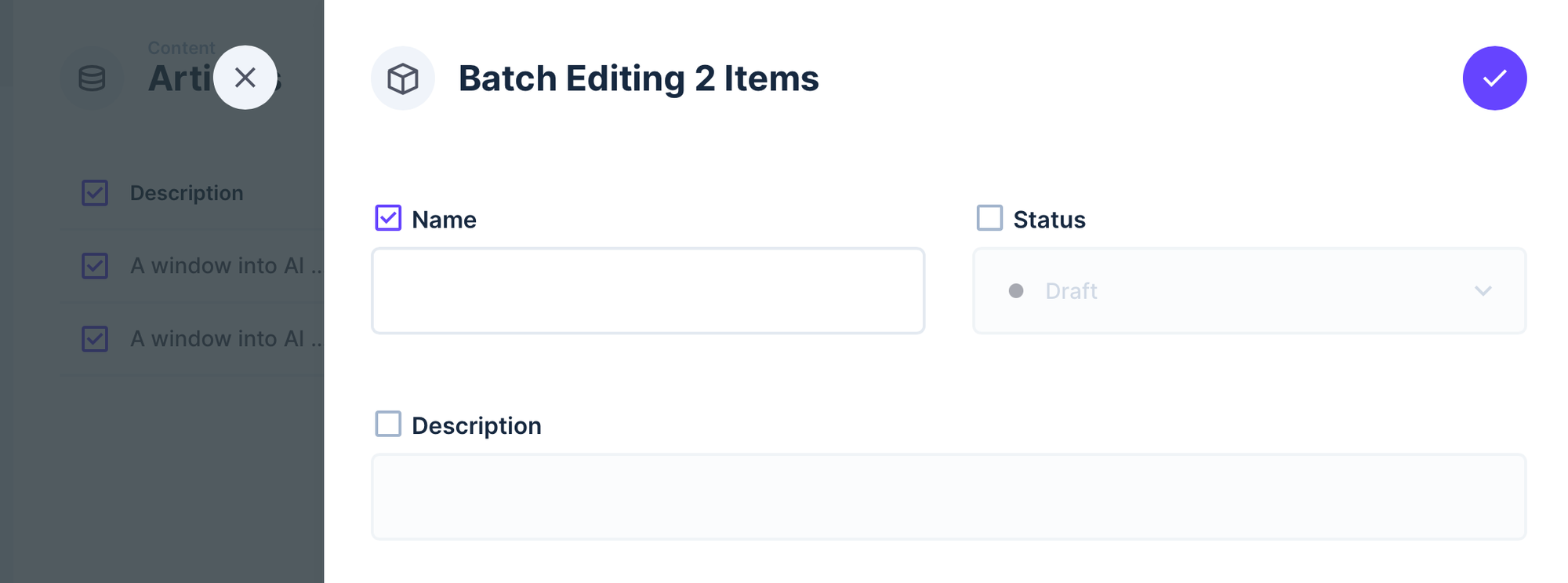
Batch Active
Much like batch mode, this property is only true when the interface is ticked and active for editing. For example, your interface could have a notice while batchActive is false, then reveal your interface when it's true.
Width
The width property will have the values half or full. You can use the to alter the appearance of your interface for each option.
Type
The type property contains the data type of the field. Here are some values that this property can have. You can limit what field types can be used with your interface in your index.ts file.
string
int
bigInt
uuid
float
decimal
text
Collection
The collection property contains the name of the current collection.
Field
The field property contains the name of the current field.
Field Data
The fieldData property contains the metadata for the current field.
Primary Key
The primaryKey property contains the current item's ID or a + for new items..
Length
If the data model has a length assigned to this field, the length property will have this number. You can use this to restrict how many characters the user can type into this field. For example, Input fields usually have limit of 255 characters.
Direction
This property isn't used very often but contains whether the interface is read left to right or right to left.