Live Preview Component
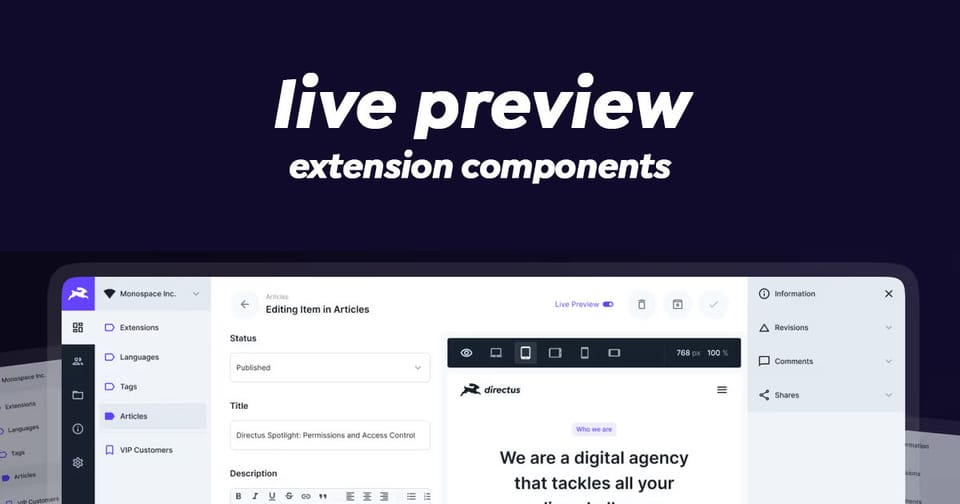
The live-preview component provides an interactive, resizable preview interface with support for visual editing, zoom controls, and multiple URL management.
Key Features
- Responsive iframe Display - Renders and manages iframe content with dynamic sizing
- Zoom & Resize Controls - Built-in zoom levels (25% to 200%) and manual dimension adjustment
- Multiple URL Support - Switch between different preview URLs with a dropdown menu
- Visual Editing Integration - Toggle editable elements and open URLs in the visual editor
- Dynamic URL Handling - Support for dynamically generated preview URLs
- Sidebar Support - Optional resizable sidebar for additional content
- Fullscreen Mode - Toggle between fixed dimensions and fullscreen preview
- Accessibility - Includes proper ARIA labels and keyboard navigation
Composition API
Props
| Prop | Type | Description |
|---|---|---|
url | string | string[] | Required, Single URL or array of URLs to preview |
dynamicUrl | string | Optional, Dynamically generated URL |
dynamicDisplay | string | Optional, Text to display instead of actual URL |
invalidUrl | boolean | Optional, Mark URL as invalid |
urlDisplay | string | Optional, Custom URL text display |
singleUrlSubdued | boolean | Optional, Subdue single URL display (default: true) |
headerExpanded | boolean | Optional, Expand header for more space |
hideRefreshButton | boolean | Optional, Hide the refresh button |
hidePopupButton | boolean | Optional, Hide the new window button |
inPopup | boolean | Optional, Display as popup window |
centered | boolean | Optional, Center content |
isFullWidth | boolean | Optional, Full width mode flag |
canEnableVisualEditing | boolean | Optional, Enable visual editor option |
version | ContentVersion, 'key' | 'name' | Optional, Content version |
showOpenInVisualEditor | boolean | Optional, Show visual editor option (default: true) |
defaultShowEditableElements | boolean | Optional, Show editable elements by default |
sidebarSize | number | Optional, Sidebar width in pixels |
sidebarCollapsed | boolean | Optional, Sidebar collapsed state (default: true) |
sidebarDisabled | boolean | Optional, Disable sidebar |
Emits
| Emit | Properties | Description |
|---|---|---|
new-window | void | User clicked open in new window |
selectUrl | newUrl, oldUrl | User switched between URLs |
saved | { collection, primaryKey } | Content saved via visual editor |
exit-full-width | void | User exited full width mode |
update:sidebarSize | size: number | Sidebar resized |
update:sidebarCollapsed | collapsed: boolean | Sidebar toggled |
Slots
| Slot | Description |
|---|---|
#display-options | Additional display options in header |
#sidebar | Sidebar content |
#notifications | Notification content |
#prepend-header | Content before header buttons |
#append-header | Content after header buttons |
#append-url | Content after URL display |
#overlay="{ frameEl, frameSrc }" | Custom overlay elements |
Usage Example
Here's how to use the component in your component:
<script setup lang="ts">
import { ref } from 'vue';
import type { ContentVersion } from '@directus/types';

// Simple single URL preview
const previewUrl = ref('https://example.com');

// Multiple URLs for switching
const previewUrls = ref([
  'https://example.com',
  'https://example.com/about',
  'https://example.com/contact'
]);

// Dynamic URL generation
const dynamicUrl = ref('https://api.example.com/preview/v1');
const dynamicDisplay = ref('Dynamic Preview');

// Version tracking for visual editor
const currentVersion = ref<Pick<ContentVersion, 'key' | 'name'> | null>({
  key: 'v1-draft',
  name: 'Draft Version'
});

// Sidebar state management
const sidebarSize = ref(333);
const sidebarCollapsed = ref(true);

// Handle URL selection changes
const handleSelectUrl = (newUrl: string, oldUrl: string) => {
  console.log(`Switched from ${oldUrl} to ${newUrl}`);
};

// Handle saved content from visual editor
const handleSaved = (data: { collection: string; primaryKey: string | number }) => {
  console.log(`Saved to ${data.collection}:${data.primaryKey}`);
};

// Handle sidebar resize
const handleSidebarResize = (size: number) => {
  sidebarSize.value = size;
};
</script>

<template>
  <!-- Simple single URL preview -->
  <live-preview
    :url="previewUrl"
    @select-url="handleSelectUrl"
  />

  <!-- Multiple URLs with sidebar -->
  <live-preview
    :url="previewUrls"
    :sidebar-size="sidebarSize"
    :sidebar-collapsed="sidebarCollapsed"
    @select-url="handleSelectUrl"
    @update:sidebar-size="handleSidebarResize"
    @update:sidebar-collapsed="(collapsed) => sidebarCollapsed = collapsed"
  >
    <!-- Additional display options in header -->
    <template #display-options>
      <!-- Custom display options here -->
    </template>

    <!-- Sidebar content -->
    <template #sidebar>
      <div class="sidebar-content">
        <!-- Your sidebar content -->
      </div>
    </template>

    <!-- Notifications area -->
    <template #notifications>
      <!-- Your notifications here -->
    </template>
  </live-preview>

  <!-- Advanced: With visual editing and dynamic URLs -->
  <live-preview
    :url="previewUrls"
    :dynamic-url="dynamicUrl"
    :dynamic-display="dynamicDisplay"
    :version="currentVersion"
    :can-enable-visual-editing="true"
    :default-show-editable-elements="false"
    @select-url="handleSelectUrl"
    @saved="handleSaved"
  >
    <!-- Custom overlay for the iframe -->
    <template #overlay="{ frameEl, frameSrc }">
      <!-- Custom overlay elements -->
    </template>

    <!-- Header customization -->
    <template #prepend-header>
      <!-- Content before header buttons -->
    </template>

    <template #append-header>
      <!-- Content after header buttons -->
    </template>

    <template #append-url>
      <!-- Content after URL display -->
    </template>
  </live-preview>
</template>
Advanced Features Explained
1. Zoom Controls
The component provides preset zoom levels (25%, 50%, 75%, 100%, 150%, 200%) that automatically adjust the iframe scale. Zoom is disabled in fullscreen mode.
// The zoom state is managed internally, but you can observe it
// through the displayed dimensions
const displayWidth = ref(1200);  // Actual rendered width
const displayHeight = ref(800);  // Actual rendered height
2. Visual Editing Integration
When enabled, the component integrates with Directus's visual editor:
const canEnableVisualEditing = true;
const version = {
  key: 'content-version-key',
  name: 'Version Name'
};

// Listen for saves from the visual editor
@saved="handleSaved"
3. Dynamic URLs
The component can maintain both static and dynamic URLs:
const staticUrls = ['https://example.com', 'https://example.com/about'];
const dynamicUrl = 'https://api.example.com/preview'; // Generated dynamically
// The dynamic URL will appear in the dropdown if different from static URLs
4. Sidebar Management
The sidebar uses a split panel for resizable content:
const sidebarSize = ref(333);        // Default width in pixels
const sidebarCollapsed = ref(true);  // Collapsed state

// Snap points: component snaps at 333px width
// Min size: 252px
// Max size: 540px
Internal Methods & State
The component provides a global window.refreshLivePreview() method that can refresh the iframe:
// Refresh with current URL
window.refreshLivePreview(null);

// Refresh with specific URL
window.refreshLivePreview('https://example.com/new-path');
Styling Customization
The component uses CSS custom properties for theming:
--preview--color: Navigation button foreground color
--preview--color-disabled: Disabled state color
--preview--header--background-color: Header background
--preview--header--border-color: Header border
--preview--header--height: Header height (2.5rem or 3.375rem expanded)
Accessibility Features
- ARIA labels on all buttons (
v-tooltipdirectives) - Proper button states (
aria-pressed) - Semantic HTML structure
- Keyboard-navigable controls
- Iframe has appropriate
titleattribute
Performance Considerations
- Uses
ResizeObserverfor responsive dimension tracking - Efficient watchers with lazy initialization
- Computed properties for derived state
- Event-based updates to parent components
Wrapping Up
Live Preview and Visual Editor is a powerful component for integrating Directus with your website and giving users a meaningful view of the data. Make sure to set up your website to fetch content from Directus.
