Image Editing Component
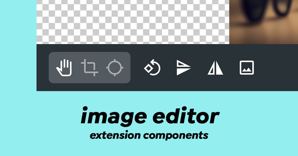
The image-editor component is a sophisticated interface based on CropperJS that enables users to edit images within Directus. It provides a professional image editing experience with cropping, rotation, flipping, focal point selection, and aspect ratio management capabilities.
Key Features
- Image Cropping - Precisely crop images with visual feedback
- Image Rotation - Rotate images in 90-degree increments
- Flip Operations - Flip images horizontally or vertically
- Aspect Ratio Control - Support for multiple preset aspect ratios (16:9, 3:2, 5:4, 7:5, 1:1, custom ratios, and free crop)
- Focal Point Selection - Mark the focal point of an image for responsive design workflows
- Real-time Dimensions - Live display of current image dimensions and changes
- SVG Support - Seamless handling of SVG files with automatic PNG conversion
- Multi-mode Editing - Three editing modes: Move, Crop, and Focal Point
Composition API
Props
The component accepts the following props:
| Prop | Type | Description |
|---|---|---|
id | string | The file ID from Directus |
modelValue | boolean | Controls modal visibility (v-model support) |
Emitted Events
The component emits two key events:
update:modelValueboolean. Emitted when the modal visibility changes.refreshvoid. Emitted after successful image save
Usage Example
Here's how to implement the ImageEditor component in your extension:
<script setup lang="ts">
import { ref } from 'vue';

// Track modal visibility
const editorActive = ref(false);

// The file ID you want to edit
const fileId = ref('123e4567-e89b-12d3-a456-426614174000');

// Handle successful image updates
const handleImageRefresh = () => {
  console.log('Image updated successfully');
  // Optionally refresh your file data here
};

// Open the editor
const openImageEditor = () => {
  editorActive.value = true;
};

// Close the editor
const closeImageEditor = () => {
  editorActive.value = false;
};
</script>

<template>
  <div>
    <button @click="openImageEditor">Edit Image</button>

    <image-editor
      :id="fileId"
      v-model="editorActive"
      @refresh="handleImageRefresh"
    >
      <!-- Activator slot - content that triggers the editor -->
      <template #activator="{ on }">
        <img src="/assets/<file-id>" v-on="on" alt="Click to edit" />
      </template>
    </image-editor>
  </div>
</template>
Editing Modes
Move Mode
Default mode for positioning and viewing the image without modifications.
Crop Mode
Allows users to define a crop area with adjustable aspect ratios. The component displays preview dimensions in real-time.
Focal Point Mode
A specialized mode for selecting a focal point (center point) on the image. This is particularly useful for responsive image design where you want to ensure important content remains visible across different aspect ratios.
Aspect Ratio Options
The component supports:
- 16:9 (widescreen)
- 3:2 (classic)
- 5:4 (standard)
- 7:5 (intermediate)
- 1:1 (square)
- Original (maintains original dimensions)
- Free (unrestricted cropping)
- Custom aspect ratios (from Directus settings)
Technical Architecture
The component uses a clean separation of concerns with two main composables:
useImage()
Manages image data and file operations:
- Fetches image metadata from the Directus API
- Handles image save operations with focal point data
- Tracks loading, error, and saving states
- Manages focal point and crop data persistence
useCropper()
Encapsulates CropperJS integration:
- Initializes and destroys the Cropper instance
- Manages aspect ratio calculations
- Handles rotation, flip, and reset operations
- Tracks dimension changes during editing
Important Behaviors
Focal Point & Crop Coordination
The component intelligently handles simultaneous focal point and crop modifications:
- If only focal point is changed, it saves the focal point coordinates
- If only crop is changed, it saves the cropped image
- If both are changed, it combines them into a single API request for efficiency
SVG Handling
SVG images are automatically converted to PNG when edited, with the new dimensions clearly indicated in the interface (e.g., "SVG → PNG 800x600").
Changes Are Permanent
The component displays a prominent warning: "changes_are_permanent" - users cannot undo modifications after saving.
Data Fetched from Directus API
When the editor opens, it requests the following image fields:
type- MIME typefilesize- File size in bytesfilename_download- Original filenamewidth- Image widthheight- Image heightfocal_point_x- X coordinate of focal pointfocal_point_y- Y coordinate of focal point
Styling & Customization
The component uses CSS custom properties for theming:
--theme--background-subdued- Editor background--theme--foreground-subdued- Dimension text color--theme--warning- Warning text color--theme--border-radius- Button border radius
The toolbar uses a fixed dark background (#263238) with semi-transparent white buttons for maximum visibility during editing.
Error Handling
The component gracefully handles:
- Failed API requests (displays error notice)
- Image loading failures
- Invalid blob generation during save
Wrapping Up
The Image Editor brings powerful features to your extensions such as cropping, rotation, flip and focal points within a simple component and it also handles saving the changes.