File Lightbox Component
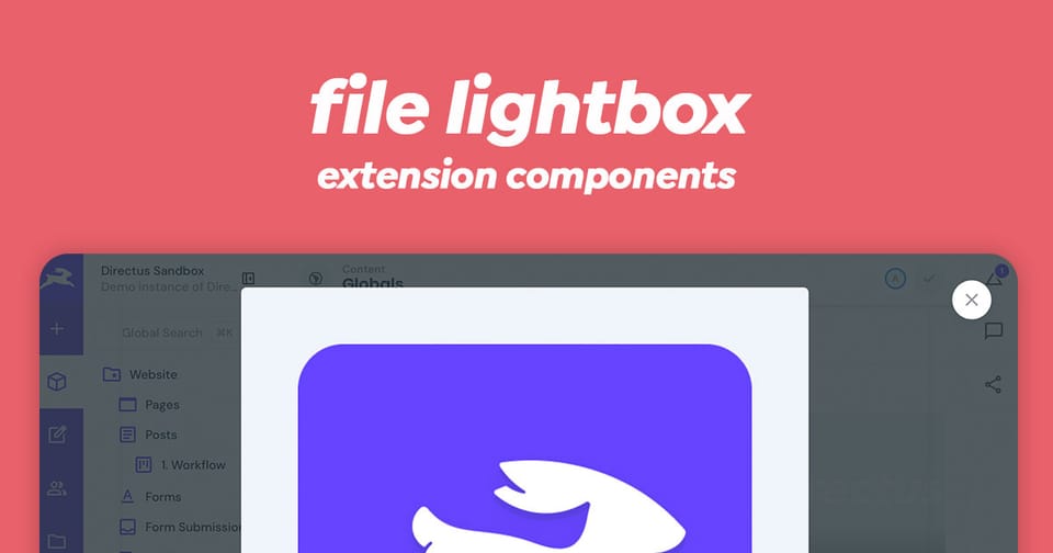
The FileLightbox component is a Vue 3 modal dialog component built specifically for Directus that displays files (particularly images and videos) in a fullscreen lightbox view. It wraps the FilePreview component and provides an elegant way to view file assets in an expanded, modal context.
What It Does
The FileLightbox component:
- Displays files in a responsive modal dialog
- Shows images, videos, and other media types in an expanded view
- Manages modal state through Vue's composition API
- Provides a close button in the top-right corner
- Closes when users press the
Esckey - Automatically closes when clicking on the preview content
Component API
Props
| Prop | Type | Required | Description |
|---|---|---|---|
modelValue | boolean | Required | Controls whether the lightbox modal is open or closed. Use with v-model |
file | File object | Required | File object containing id, title, type, modified_on, width, height |
src | string | Optional | Direct URL to the file. If provided, bypasses the default asset URL computation |
Emits
The component emits an update event when the modal state changes, allowing v-model binding to work properly.
Usage Example
Basic Setup
<script setup lang="ts">
import { ref } from 'vue';
import type { File } from '@directus/types';

// Track lightbox visibility
const isLightboxOpen = ref(false);

// Your file object from Directus
const fileObject: Pick<File, 'id' | 'title' | 'type' | 'modified_on' | 'width' | 'height'> = {
  id: 'uuid-1234-5678',
  title: 'My Image',
  type: 'image/jpeg',
  modified_on: '2024-03-24T10:30:00Z',
  width: 1920,
  height: 1080,
};
</script>

<template>
  <!-- FileLightbox with v-model binding -->
  <file-lightbox v-model="isLightboxOpen" :file="fileObject">
    <!-- Activator slot: what triggers the lightbox -->
    <template #activator="{ on }">
      <button @click="on.click">
        Open Lightbox
      </button>
    </template>
  </file-lightbox>
</template>
With Custom Image Preview
<script setup lang="ts">
import { ref } from 'vue';

const isLightboxOpen = ref(false);

const fileObject = {
  id: 'my-file-id',
  title: 'Photo Gallery Image',
  type: 'image/png',
  modified_on: new Date().toISOString(),
  width: 2560,
  height: 1920,
};
</script>

<template>
  <file-lightbox v-model="isLightboxOpen" :file="fileObject">
    <template #activator="{ on }">
      <img
        src="thumbnail.jpg"
        alt="Click to expand"
        style="cursor: zoom-in; max-width: 200px;"
        @click="on.click"
      />
    </template>
  </file-lightbox>
</template>
With Direct Source URL
Use the src prop to bypass Directus asset URL computation and provide a direct image URL:
<script setup lang="ts">
import { ref } from 'vue';

const isLightboxOpen = ref(false);

const fileObject = {
  id: 'placeholder-id',
  title: 'External Image',
  type: 'image/jpeg',
  modified_on: new Date().toISOString(),
  width: 1200,
  height: 800,
};

const externalUrl = 'https://example.com/external-image.jpg';
</script>

<template>
  <file-lightbox
    v-model="isLightboxOpen"
    :file="fileObject"
    :src="externalUrl"
  >
    <template #activator="{ on }">
      <button @click="on.click">View Full Size</button>
    </template>
  </file-lightbox>
</template>
Full-Featured Example
<script setup lang="ts">
import { ref, computed } from 'vue';

const lightboxOpen = ref(false);
const selectedFileId = ref<string | null>(null);

// Mock file data (in reality, this comes from Directus API)
const files = [
  {
    id: 'file-1',
    title: 'Screenshot 1',
    type: 'image/png',
    modified_on: '2024-03-20T10:00:00Z',
    width: 1920,
    height: 1080,
  },
  {
    id: 'file-2',
    title: 'Video Demo',
    type: 'video/mp4',
    modified_on: '2024-03-21T14:30:00Z',
    width: 1280,
    height: 720,
  },
];

const selectedFile = computed(() =>
  files.find(f => f.id === selectedFileId.value)
);

function openFile(fileId: string) {
  selectedFileId.value = fileId;
  lightboxOpen.value = true;
}
</script>

<template>
  <div>
    <!-- File grid -->
    <div class="file-grid">
      <div
        v-for="file in files"
        :key="file.id"
        class="file-item"
        @click="openFile(file.id)"
      >
        <img
          v-if="file.type.startsWith('image')"
          :src="`/api/assets/${file.id}?key=system-small-cover`"
          :alt="file.title"
          class="thumbnail"
        />
        <span v-else class="file-icon">{{ file.title }}</span>
      </div>
    </div>

    <!-- Lightbox modal -->
    <file-lightbox
      v-if="selectedFile"
      v-model="lightboxOpen"
      :file="selectedFile"
      preset="system-large-contain"
    >
      <template #activator="{ on }">
        <!-- Hidden activator since we're triggering from grid -->
        <div @click="on.click" style="display: none;" />
      </template>
    </file-lightbox>
  </div>
</template>

<style scoped>
.file-grid {
  display: grid;
  grid-template-columns: repeat(auto-fill, minmax(150px, 1fr));
  gap: 1rem;
}

.file-item {
  cursor: pointer;
  border-radius: 4px;
  overflow: hidden;
  aspect-ratio: 1;
  background: #f0f0f0;
  display: flex;
  align-items: center;
  justify-content: center;
  transition: transform 0.2s;
}

.file-item:hover {
  transform: scale(1.05);
}

.thumbnail {
  width: 100%;
  height: 100%;
  object-fit: cover;
}

.file-icon {
  font-size: 0.875rem;
  text-align: center;
  padding: 1rem;
}
</style>
Key Features
✅ Modal Dialog Integration: Uses Directus's v-dialog component for consistent UI
✅ Multi-format Support: Displays images, videos, audio, and other media types
✅ Responsive Design: Automatically adjusts to viewport height (85vh in modal)
✅ Keyboard Support: Closes on Esc key press
✅ Click-to-Close: Clicking the preview content closes the modal
✅ v-model Binding: Full support for Vue 3's v-model directive
✅ Asset Optimization: Integrates with Directus asset transformation system
Styling Customization
The FileLightbox component uses CSS custom properties and is styled through the Directus theme system. The modal background and button styling are automatically applied based on your theme configuration.
To customize appearance, override these Directus theme variables in your CSS:
--theme--foreground-subdued- Close button text color--theme--background- Modal background--white- Close button background
Performance Considerations
- For external URLs, use the
srcprop to avoid unnecessary asset URL transformations - The component only renders when
modelValueistrue, keeping the DOM lightweight
Wrapping Up
The File Lightbox component is a great way to preview media natively in Directus. Make sure to use the Directus API to fetch the required files and provide the file object to the component.