Drawer Item Component
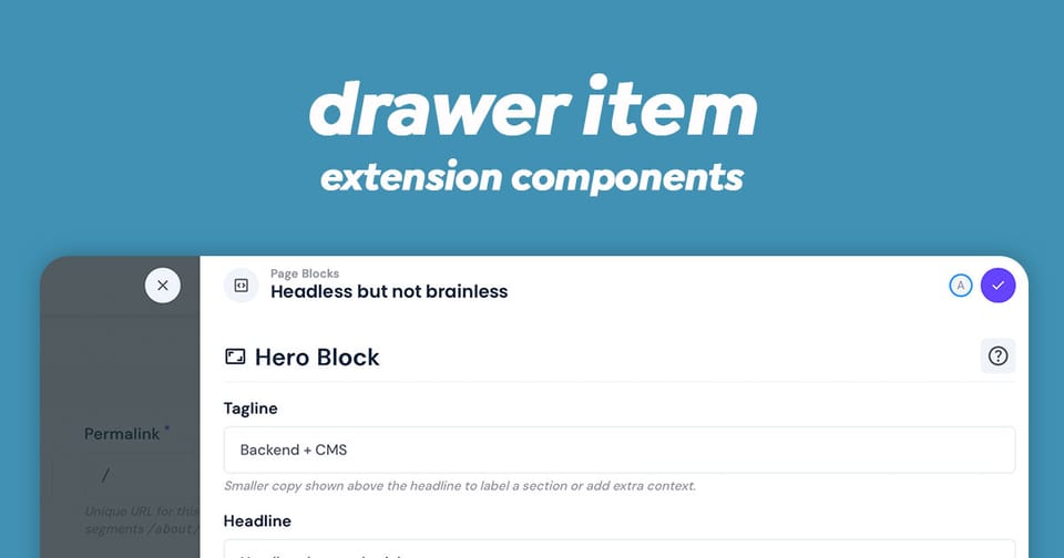
The drawer-item component is drawer in Directus that provides a flexible overlay interface for editing collection items. It can render as three different overlay types: a drawer, modal, or popover - making it highly versatile for various UI contexts.
This component serves as the powerful interface for item creation and editing in Directus, with built-in support for form validation, data persistence, unsaved changes warnings, and real-time collaboration.
Key Features
- Multiple Overlay Types: Renders as a drawer, modal, or popover based on configuration
- Item Management: Create new items or edit existing ones
- Related Data Handling: Support for junction fields and related collections (many-to-many, many-to-any relationships)
- Form Validation: Comprehensive validation with error feedback
- Collaboration Support: Real-time editing with collision detection and conflict resolution
- Unsaved Changes Protection: Intelligent guards that prevent accidental data loss
- Keyboard Shortcuts: Quick save/cancel actions via keyboard
- Permission Awareness: Respects field-level permissions
- Content Versioning: Optional support for editing specific content versions
Component Props
| Prop | Type | Description |
|---|---|---|
overlay | 'drawer' | 'modal' | 'popover' | Display configuration, default: 'drawer' |
collection | string | Required: Target collection name |
primaryKey | primaryKey | null | Item ID ('+' for new items) |
relatedPrimaryKey | primaryKey | For related items (default: '+') |
active | boolean | Visibility state |
edits | Record | Pre-populated edits |
junctionField | string | null | Field name for M2M/M2A relationships |
circularField | string | null | Field to block (prevents circular relations) |
junctionFieldLocation | string | Position metadata for junction fields |
disabled | boolean | Disable form submission |
nonEditable | boolean | Disable all editing |
selectedFields | string[] | null | Restrict visible fields |
popoverProps | Record | Additional props for popover mode |
applyShortcut | ApplyShortcut | Keyboard shortcut for save (default: 'meta+enter') |
preventCancelWithEdits | boolean | Require confirmation to cancel |
version | ContentVersion['key'] | null | Specific version to edit |
Emit Events
The component emits two key events:
| Attribute | Type | Description |
|---|---|---|
update:active | [value: boolean] | Emitted when overlay visibility changes |
input | [value: Record | Emitted when item is saved with changes |
Usage Example
Simple Item Editor
The Drawer Item is available to extensions without needing to import in your script. Here is an example of a basic single item selection drawer:
<script setup lang="ts">
import { ref } from 'vue';

// Track the drawer visibility
const isDrawerOpen = ref(false);
const itemId = ref<string | null>(null);

// Handle drawer closing
const handleDrawerClose = (isOpen: boolean) => {
  isDrawerOpen.value = isOpen;
};

// Handle item save
const handleItemSave = (updatedData: Record<string, any>) => {
  console.log('Item saved with changes:', updatedData);
  // Perform any additional actions after save
};
</script>

<template>
  <div>
    <button @click="() => { isDrawerOpen = true; itemId = '123'; }">
      Edit Item
    </button>

    <drawer-item
      :active="isDrawerOpen"
      collection="articles"
      :primary-key="itemId"
      @update:active="handleDrawerClose"
      @input="handleItemSave"
    />
  </div>
</template>
Creating New Items
The Drawer Item component can create new items by setting the primary-key attribute to +.
<script setup lang="ts">
import { ref } from 'vue';

const isCreating = ref(false);

const handleNewItemCreated = (newData: Record<string, any>) => {
  console.log('New item created:', newData);
  isCreating.value = false;
  // Refresh your items list here
};
</script>

<template>
  <drawer-item
    :active="isCreating"
    collection="products"
    primary-key="+"
    overlay="drawer"
    @update:active="(val) => isCreating = val"
    @input="handleNewItemCreated"
  />
</template>
Modal Variant for Important Edits
An example of editing an item as a model instead of a drawer.
<script setup lang="ts">
import { ref } from 'vue';

const editModalActive = ref(false);
const editingItemId = ref<string | null>(null);

const openItemModal = (id: string) => {
  editingItemId.value = id;
  editModalActive.value = true;
};
</script>

<template>
  <drawer-item
    :active="editModalActive"
    collection="users"
    :primary-key="editingItemId"
    overlay="modal"
    @update:active="(val) => editModalActive = val"
    @input="(data) => console.log('User updated:', data)"
  />
</template>
Handling Related Items (Many-to-Many)
Additional attributes are required for relational fields. Make sure to fetch this information in your index.ts and make it available to your due scripts.
<script setup lang="ts">
import { ref } from 'vue';

const editDrawerActive = ref(false);
const currentItemId = ref<string | null>(null);

const openArticleWithTags = (articleId: string) => {
  currentItemId.value = articleId;
  editDrawerActive.value = true;
};

const handleArticleWithTagsSave = (changes: Record<string, any>) => {
  // Changes include both the article data and the related tags
  console.log('Article and tags updated:', changes);
};
</script>

<template>
  <drawer-item
    :active="editDrawerActive"
    collection="articles"
    :primary-key="currentItemId"
    junction-field="article_tags"
    related-primary-key="+"
    overlay="drawer"
    @update:active="(val) => editDrawerActive = val"
    @input="handleArticleWithTagsSave"
  />
</template>
Popover for Inline Editing
This one is quite useful if you want the model to appear over the current item. For larger collections, I recommend using the selectedFields attribute to restrict the view.
<script setup lang="ts">
import { ref } from 'vue';

const popoverActive = ref(false);
const targetElement = ref<HTMLElement | null>(null);

const openQuickEdit = (event: MouseEvent) => {
  targetElement.value = event.currentTarget as HTMLElement;
  popoverActive.value = true;
};
</script>

<template>
  <div>
    <button ref="targetElement" @click="openQuickEdit">
      Quick Edit
    </button>

    <drawer-item
      v-if="popoverActive"
      :active="popoverActive"
      collection="posts"
      primary-key="456"
      overlay="popover"
      :popover-props="{
        trigger: 'click',
        referenceElement: targetElement
      }"
      @update:active="(val) => popoverActive = val"
      @input="(data) => console.log('Quick edit saved:', data)"
    />
  </div>
</template>
With Field Selection
Provide a list of fields to restrict the view for a simpler experience or a scoped purpose. Hidden fields will remain untouched or for new items, hidden fields will be their default values or null.
<script setup lang="ts">
import { ref } from 'vue';

// Only show specific fields
const selectedFields = ['title', 'description', 'status', 'author'];

const isDrawerOpen = ref(false);
</script>

<template>
  <drawer-item
    :active="isDrawerOpen"
    collection="articles"
    primary-key="article-123"
    :selected-fields="selectedFields"
    overlay="drawer"
    @update:active="(val) => isDrawerOpen = val"
    @input="(data) => console.log('Changes:', data)"
  />
</template>
With Unsaved Changes Protection
A useful feature to prevent loosing unsaved changes because closing the drawer will destroy the form.
<script setup lang="ts">
import { ref } from 'vue';

const isEditing = ref(false);

// Require confirmation before closing if there are unsaved changes
</script>

<template>
  <drawer-item
    :active="isEditing"
    collection="settings"
    primary-key="app-config"
    :prevent-cancel-with-edits="true"
    overlay="drawer"
    @update:active="(val) => isEditing = val"
    @input="(data) => console.log('Settings saved:', data)"
  />
</template>
Advanced Features
Collaboration Indicators
When multiple users edit the same item simultaneously, v-drawer-item displays collaboration indicators in the header, showing:
- Active collaborators
- Connection status
- Field focus indicators
Keyboard Shortcuts
- Save:
Cmd/Ctrl + Enter(customizable viaapplyShortcut) - Cancel:
Escapekey - In popover mode, these shortcuts are active; drawer and modal have built-in shortcut handlers
Validation
The component performs full form validation before saving:
- Required field checks
- Custom field validators
- Nested validation for related items
- Displays validation errors inline
Common Patterns
Pattern 1: Edit Button Integration
<button @click="() => { activeId = item.id; showDrawer = true }">
  Edit {{ item.name }}
</button>
Pattern 2: Responding to Save Events
The drawer won't save changes to the collection. This must be handled on the input event. The input noted as changes below, will contain the payload needed for the POST or PATCH to the Directus API.
@input="(changes) => {
  // Merge changes with local state
  Object.assign(currentItem, changes);
  // Refresh related data if needed
}"
Pattern 3: Conditional Display
In your index.ts, you can use the Permissions store a determine if the current user can edit or create items within the current collection. If you pass this onto your Vue script as canEdit, then you can hide or show the drawer accordingly.
<!-- Only show drawer if user has edit permissions -->
<drawer-item
  v-if="canEdit"
  :active="showDrawer"
  collection="articles"
  :primary-key="selectedId"
/>
It's also worth disabling the edit button to reflect this permission back to the user.
Notes for Implementation
- The component automatically handles permissions checking at the field level
- Unsaved changes are NOT protected unless explicitly enabled via
preventCancelWithEdits - The component uses Directus's internal API to fetch data but NOT save data.
- Real-time collaboration features work automatically if configured in your Directus instance
- Form validation is schema-aware and respects field configurations
Conclusion
This powerful component is natively available to extensions without the need to import. Make sure to update Directus to the latest version to make use of collaboration and the overlay modes.